Interview and photo credit goes to Dot & Bo.
A company that values fun, authenticity, and aesthetics above all else, it comes as no surprise that TINT—the biggest social media display tool—has an office that feels bright, airy, and original. We were lucky enough to see inside and chatted with People Operations Manager, Jessica Young, about how this workplace got its unique style. Join us as we explore its fresh design below.
The Style
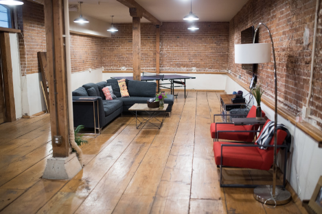
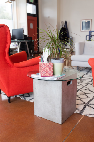
It’s nearly impossible to give only one defining label to TINT’s style. Jessica suggests the term “rus-tech” (a combination of rustic + fun tech looks), but is quick to add in some other suggestions her team came up with. Names like Baller on a Budget and Yard Sale Chic nod to the scrappy origins of this workspace’s furnishings while Warm Red Vibes and Phresh AF speak to the approachable and inimitable qualities of the space.
Balanced between what is comfortable and what is functional, the warm tones and second-hand furnishings are beautiful, but not distracting.
“I wanted this office to feel like someplace you would want to hang out in,” Jessica explains, “It’s like your best friend’s house (your best friend that has a good sense of style)!”

The Design Challenge
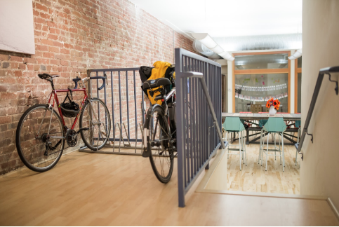
This office space is three times the size of their original location. On a shoestring budget and with limited resources, Jessica thought carefully about how she could bring in a large number of designs that would also look great together.

“It ended up being a fun challenge,” she tells us, “it required creativity, patience, flexibility, and resourcefulness.”
The Furniture
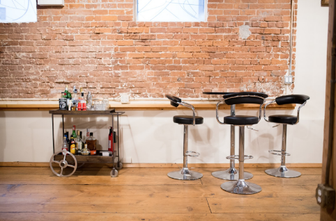
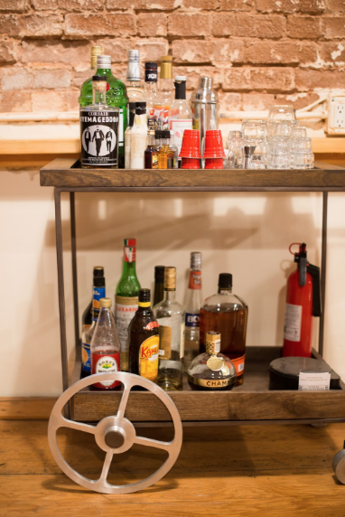
With around 10,000 square feet of space, it’s truly incredible that Jessica was able to furnish everything on a budget of about $3,000. She cleverly chose flexible furnishings that could morph depending on what you paired them with, allowing for a versatile range of designs that could be moved if necessary.
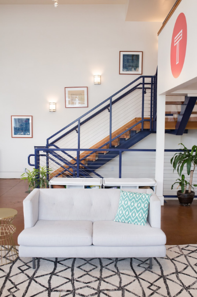
She also limited herself to one big ticket item: the sofa in the media room. The rest of the designs are previously owned, less pricey pieces.
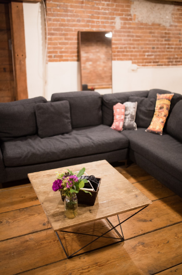
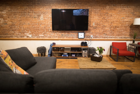
When picking out each furnishings, Jessica made sure to consider the purpose they would serve. Some of the furniture is light and easy to move, encouraging you to create your own setting, while other designs are larger and more stationary, setting up a specific type of environment for that area.
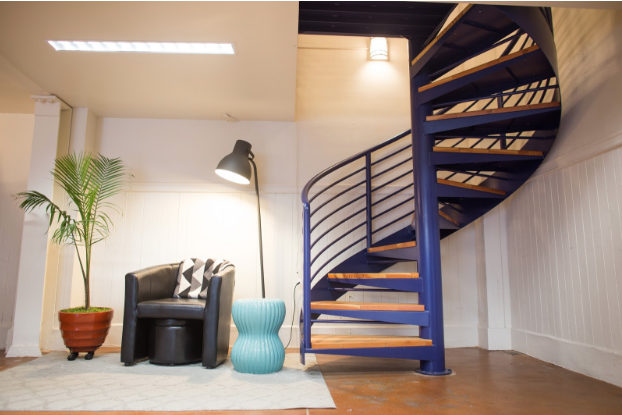
The Inspiration
Jessica wanted the style of the office to feel true to who TINT is as a team. She knew she had to strike a balance between bold and reserved, masculine and feminine looks.
She also put a huge emphasis on collaborative spaces. From seating areas to shared workspaces, each part of the office has at least one gathering place for people to come together. It’s no surprise that at the heart of the office is the communal kitchen and dining space. You can see some of TINT’s amazing community on their Instagram @TINT.
This focus on collaborative areas is a physical reflection of the company’s value—to blend communities and styles.
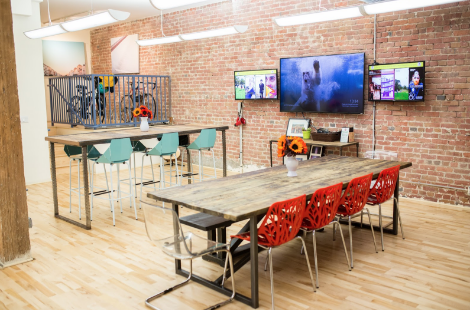
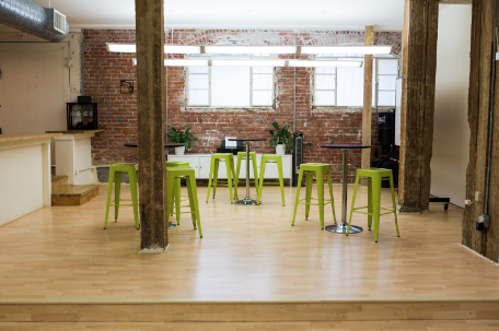
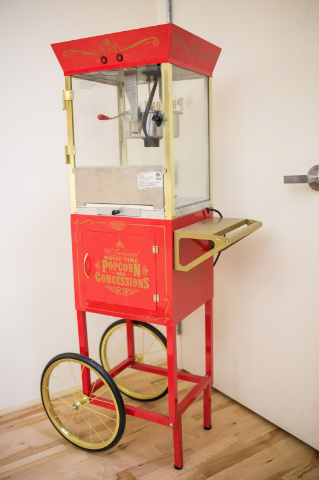
Personal décor and photography are other ways in which the TINT team has been incorporated into the office’s style. Two private offices that are dedicated to photobooth pictures and a timeline of photographs that represent TINT milestones.
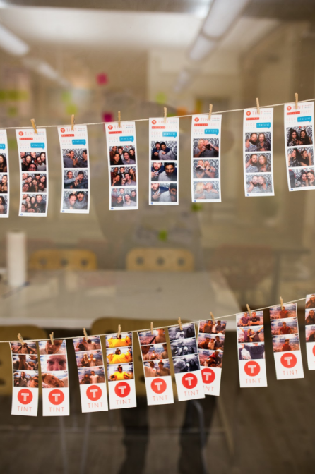
“We found that these elements really help our team connect with the space and make it feel like home,” Jessica tells us.
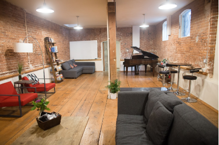
A few musical instruments can also be found throughout this workplace. A guitar and piano can often be heard during the day, their soft sounds drifting through the office on warm afternoons.
The Private Spaces
Each employee has their own workspace. There, they can hunker down for some solo time when necessary. There’s also a mix of quiet workspaces and small meeting areas.
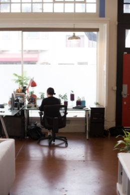

Although there are only a couple of actual closed-door offices, Jessica and her team have maximized the illusion of solitary spaces with intimate vignettes and quiet corners.
“I love seeing individual colleagues working in some of the big comfy chairs in our lobby or seeing a meeting take place on the sectional sofas in our media room,” Jessica muses.
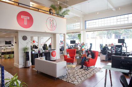
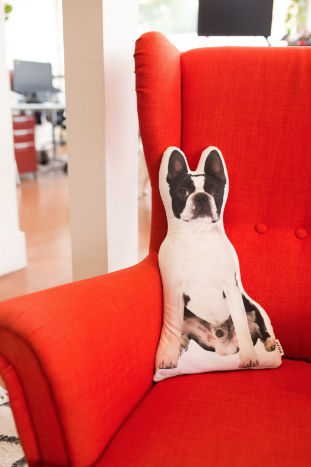
Office style should be just as fabulous as any home’s and a workplace should reflect its companies values and employees. TINT is a leading example of both of these design ethos. Jessica Young and her team have done an incredible job creating an aesthetic that fosters community as well as the production of better content for clients. We’re so impressed with this scrappy social media company’s space and hope to see more offices follow suit!
What’s Next? Learn more about TINT on their website here and come visit us! Just drop us an email and we can set it up!


